Christopher French
An Interview with Janet Goleas
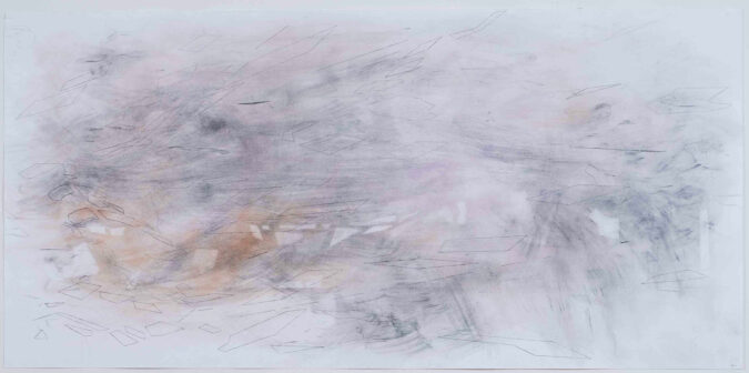
Christopher French creates minimalist abstractions infused with memory, light and a degree of perception that extends beyond sight. His radiant geometries reference a landscape of light and shadows in precise compositions. Layering pigment in thin veils, French crisscrosses shafts of color as they traverse the image field in crystalline tonalities.
(This interview took place in East Hampton on September 10, 2016 during Christopher French’s exhibition, An Alphabet of Sites, at The Drawing Room.)
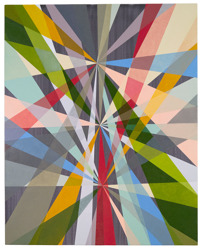
Arranging the Aftermath, August 9, 2016, acrylic and oil on linen, 30 x 38 inches
Janet Goleas: Thank you all for being here to talk with Christopher French whose show, An Alphabet of Sites is on view all around us. Let’s start with some of the primary aspects in your work, Chris, which I would say are color, structure and sight. You’ve mentioned the historian Leo Steinberg and his 1953 essay, “The Eye Is a Part of The Mind.” That seems to have particular significance in this body of work.
Christopher French: That goes back to Descartes, I think who said basically the same thing. Perception is reality, for a lot of people, and I think the filter of that perception is the mind and how it constructs or deconstructs reality. But essentially, these paintings are tied into the landscape – my landscape. I’ve been living on the East End of Long Island for eight years now, and we’ve lived in two places here. Each time my location has changed my work has also changed. The first place we lived was like “little house on the prairie” – no trees, a large field behind us, great sunsets, nothing but sunshine. The place we live now has a woodlands quality to it. There are a lot of trees and a lot of shadows — in my paintings you can think of the trajectories as shadows. Of course every shadow has a correspondence to light, so when I first became immersed in this body of work, my thought was “how do you interpret a shadow?
Trace Overlaps, July 29, 2016, acrylic on linen, 24 x 18 inches
Before this work, color for me was very site-specific. I’d use my camera and actually sample my garden and other sites, coming back with a whole vocabulary of color. Not the green you see, for instance, outside your window, but let’s say a cabbage that’s starting to die. I collected these swatches – almost like a palette – and then I would create arrangements. The color choices were very site-specific.
JG: Are you referring to your Braille paintings?
CF: Yes. I also write, so using text as a starting point is of interest to me. Back in the 1980s I found a book of Braille paper. Back then, people in New York just threw things on the street – it was the best time to find things. I actually wrote an article called “My trash is better than your art,” (laughter) because the trash was so interesting — you could find anything – New York isn’t like that anymore. Anyway, I found this book of Braille paper. At the time I was painting imagistically using found images. The paper had great texture so at first I collaged images on to it using the Braille as a sort of text-based diagram. I went about trying to find an abstract way of creating a painting that had text in it. At a certain point I thought “I might be running into a problem here, I should figure out what this is saying.” I learned to read Braille and to write it, which was very laborious. They make Braille typewriters but I never got one of those. There are publishing houses for the blind, so I would work readymade books – Lewis Carroll, Shakespeare – I made some of my own writings and I worked with those. Using these texts I made abstract paintings that largely used color in a symbolic context. In some ways these new paintings go back to that symbolic usage, as opposed to the site-specific color I had used previously.
JG: So the color in those paintings was very specific to language or literature. How did you do that?
CF: The words became a point of departure – so in that way it was very symbolic. Say it’s the play King Lear. I identified 35 different colors and embarked on a randomization of those colors across 35 sheets of Lear’s scene on the heath, which I had collaged onto a canvas. Lear was the primary color in the center with all the other colors circulating around him, just like the actors in the play. It was never overtly storytelling, just like my new work does not overtly depict shadows.
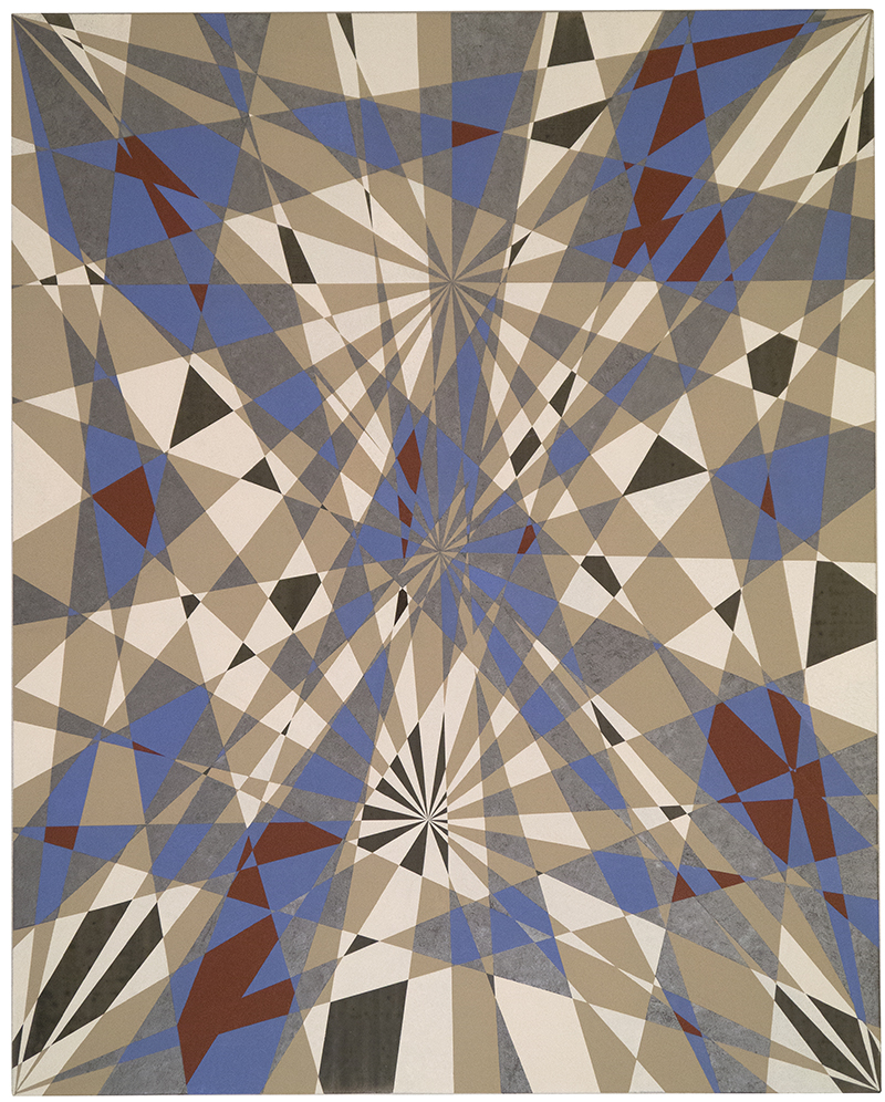
Remains of the Day, October 19, 2010 Braille, paper with oil and acrylic on linen, 21 x 20 1/2 inches
JG: What is Braille paper like?
CF: It’s tough and built to be fondled. You have to touch it a lot – so it’s very resilient.
JG: In your Braille paintings are you “fighting” the surface?
CF: No, I like to think that I’m emphasizing the surface. There’s a European term that I really like called haptisch, which roughly translates as “visual touching.” It’s like eye candy in a way – you want to get close to it, to touch it – and of course that’s the last thing you’re supposed to do with a painting. In my Braille paintings I randomized the colors. It’s a game of constructing a work in which no single color is repeated vertically or horizontally. They begin improvisationally – I start in the middle with lots of options, and work my way out, so by the time I get close to the edge it becomes a negotiation.
JG: Interesting you would bring that up. I have a note here about David Rhodes writing on an Albers exhibition in Berlin. He said, “Albers transforms the haptic into light and space.” Like Albers, at first glance your paintings look very systematized, especially from a distance, but as you get closer there’s a density and physicality to the paint that makes the color both the subject and the object in a very visceral way.
CF: That’s a good reading. Well, I started off as a gestural painter – I went to school at UC Davis, a lot of the Bay Area artists were heavily invested in gesture whether it was Wiley or Arneson. But for me, Guston was a real appeal early on. His were physical paintings – with a lot of texture – but they were also psychologically charged. Texture has always been important in my work and what I’ve done now is sort of grind it down. I developed a real aversion to gesture in my own work. I feel the closer I get to transparency or translucency the better the paintings go.
JG: Interesting – can you discuss that?
CF: It allows me interaction with all these colors that I wouldn’t be able to put in the playing field otherwise. Each of those nodes (points to vector points in painting) has the same 12 different colors on them, but they interact in ways that I couldn’t have predicted. So the main concept is how I place the nodes. Secondly are my color choices and the third is what I will use as my ground. I can give the painting a lot of contrast – a lot of punctuation, so to speak. Or I can create colors that are recessive. These color choices are really critical. And, again, while they’re not specific landscape references, they’re definitely inspired by the landscape.
JG: This collision between improvisation and system — is there a way it manifests itself the most in your process?
CF: How I set up the working methodology is the system. Right before this I was layering different kinds of organic structures, whether they were plant structures or subatomic particle structures in my paintings. There, the color was less important than how it was chosen – going back to language – how you choose your nouns and verbs, so to speak. Those choices are what made the painting successful — or not. The other important thing was how I executed the painting. I had to get all my ducks in a row and lay out the idea or it wouldn’t work. They’re not spontaneous – I just don’t paint that way. I can’t just sort of riff on things. I would be a lousy jazz musician.
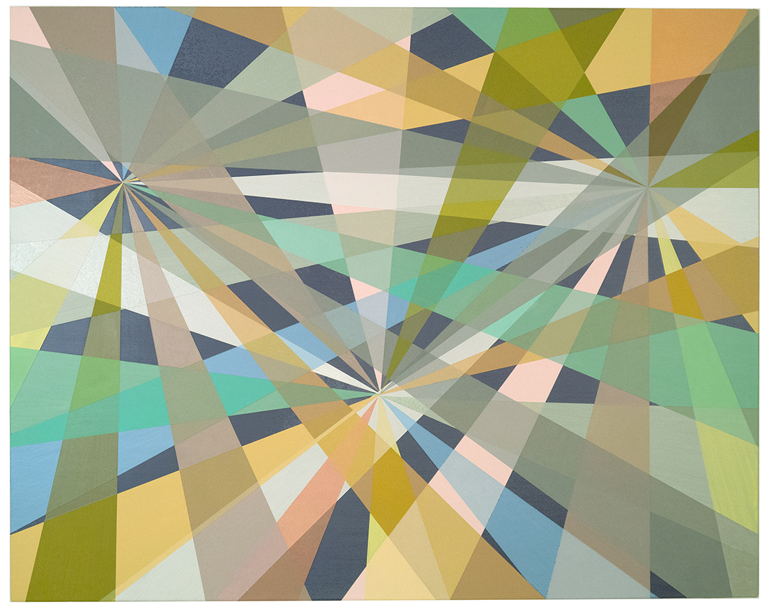
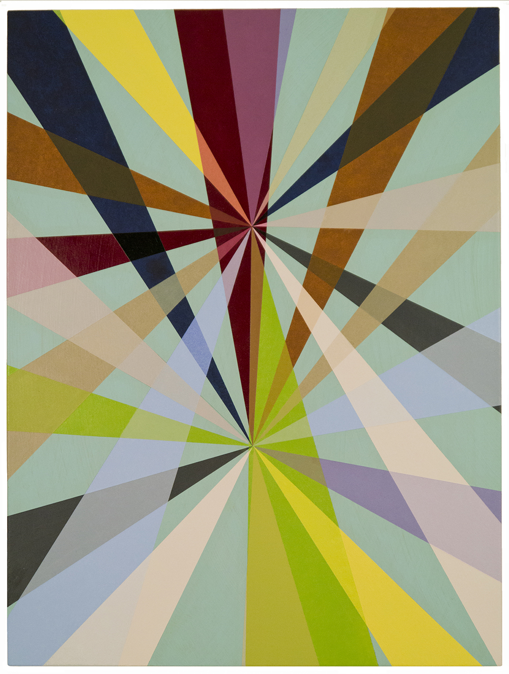
Event Horizon, August 30, 2016, oil and acrylic on linen, 30 x 38 inches
JG: When I look at this painting (points to Event Horizon) of all the works in here, the palette here keeps me awake at night. It’s so unique. I was thinking about you in terms of perspective and began looking at Piero della Francesca, whose palette in The Resurrection is muted and soft, much like this.
CF: It wasn’t inspired by that, but I’ll go back and look at it. I had no idea the painting would turn out quite this way. An Uncommon Epiphany was the first painting – that began with very high key color, a dark background and a lot of contrast, and a lot of my color in this body of work is bold or filled with contrast. But in Event Horizon the color is held in a tighter boundary that tends to go toward gray when they intermingle. That’s part of what I was hoping for. I wanted it to be different. I called it Event Horizon, which is like the point of no return – you get sucked into the black hole outside of the rainbow.
An Uncommon Epiphany, 2016, oil and acrylic on linen, 30 x 24 inches
JG: It also has a relationship to Futurism – Balla, Boccioni – you could even make an argument that ties it to Nude Descending a Staircase.
CF: There’s no body in there! That’s my favorite part of Duchamp, but I don’t think these paintings are about motion – I think of them more like maps. The reason I started with a vertical format is that I used to do a lot of backpacking and the topographical maps I relied on were squarish verticals. They showed me which part of the wilderness I was in. The backpacking I did when I was young involved charting a path, so the initial stimulation for the shadows came out of doing the long walk to pick up the paper every morning. Seeing multiple trees made me think of multiple stations which got me into thinking of charting a journey. The progressions in each of the vertical paintings can be thought of as days – there’s 24 sections in each node so you could think of it like 24 hours. Each of those is a self-contained unit but I also think of them as a person looking around – for me that was important going in.
JG: Josef Albers’s concepts in color theory and the interaction of color were so important. He said many times that color is the most relative thing in painting and he refers to different palettes as being a different climate.
CF: I would agree with that.
JG: In this group I feel like I go from summer to winter – from the North Pole to the South Pole.
CF: I like that sort of seasonal inflection. They were painted in a fairly tight range – a little over 9 months.
JG: When Vincent Longo was here he discussed “film” color – that’s color that has no surface, or has an indeterminate surface. For example, if you look into the sky on a clear day, that color blue has no surface. It also, you could argue, has no depth. Then he discussed internal color – that’s the color you see through closed eyelids, and in my own research I’ve studied impossible color – these are colors that are known to exist by physicists but that can’t be interpreted by the visual cortex. But in painting, there are two basic methodologies that we employ a lot – complementary colors which fortify each other, and the idea of simultaneous contrast. That’s when your eye gets fatigued and your brain switches the colors due to retinal fatigue. So, are any of these issues operative in your approach?
CF: Simultaneous contrast is a good starting point – the ground plays a big part in these pieces. I start the paintings horizontally, applying thin washes of acrylic. I want to create a sort of atmosphere, so there could be several different layers and several different colors embedded in those layers. Sometimes they read tonally, sometimes there’s metallic pigment which sort of sparkles, and I’ll use that to create a recessive or aggressive background. Usually all that does is establish contrast, however in Event Horizon the selection of color is much more modulated and compressed. Almost like if you only made sounds in middle range and didn’t go into high and low.
JG: There is a kind of musicality to these – some rhythmic structure.
CF: I’m not setting out for that. What I thought of when you mentioned simultaneous contrast was translucency. Surrounding one of these rays you have a gentler contrast and then where they overlap you get relative contrast, if you choose the color right, in that mini-universe. There’s often a lot of color connecting to create the veil that looks like one color is on top of the other.
JG: It must be so exhilarating to complete one of these.
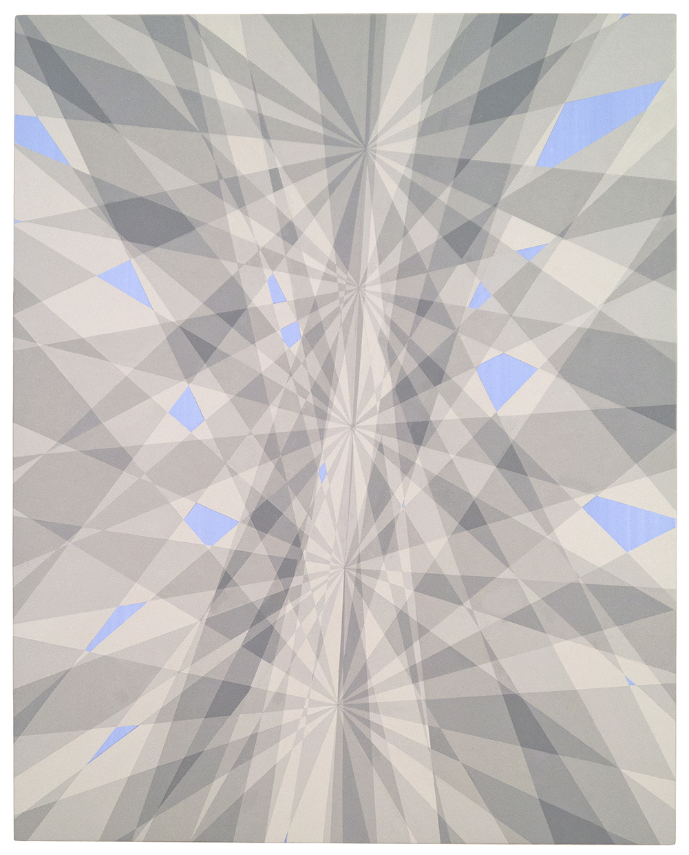
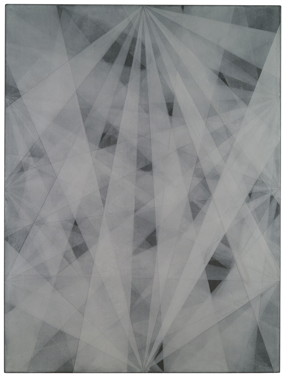
Everything Solid Melts Into Air, October 26, 2015, oil and acrylic on linen, 30 x 24 inches
CF: Or exhausting. (laughter) When you get into these layers – for instance this one was exhausting (Everything Solid Melts Into Air) – partly because it was an early one and I was just figuring out what I was doing – but also because it’s all shades of gray and after a while your eye sort of goes numb. It becomes hard to see.
JG: You must be an advocate of the long gaze – because the longer you look at these paintings the richer they become.
CF: This one (Poles Apart) has a sort of graphic punch, and you can take that away with you – there’s not as much layering going on there – it’s really tight.
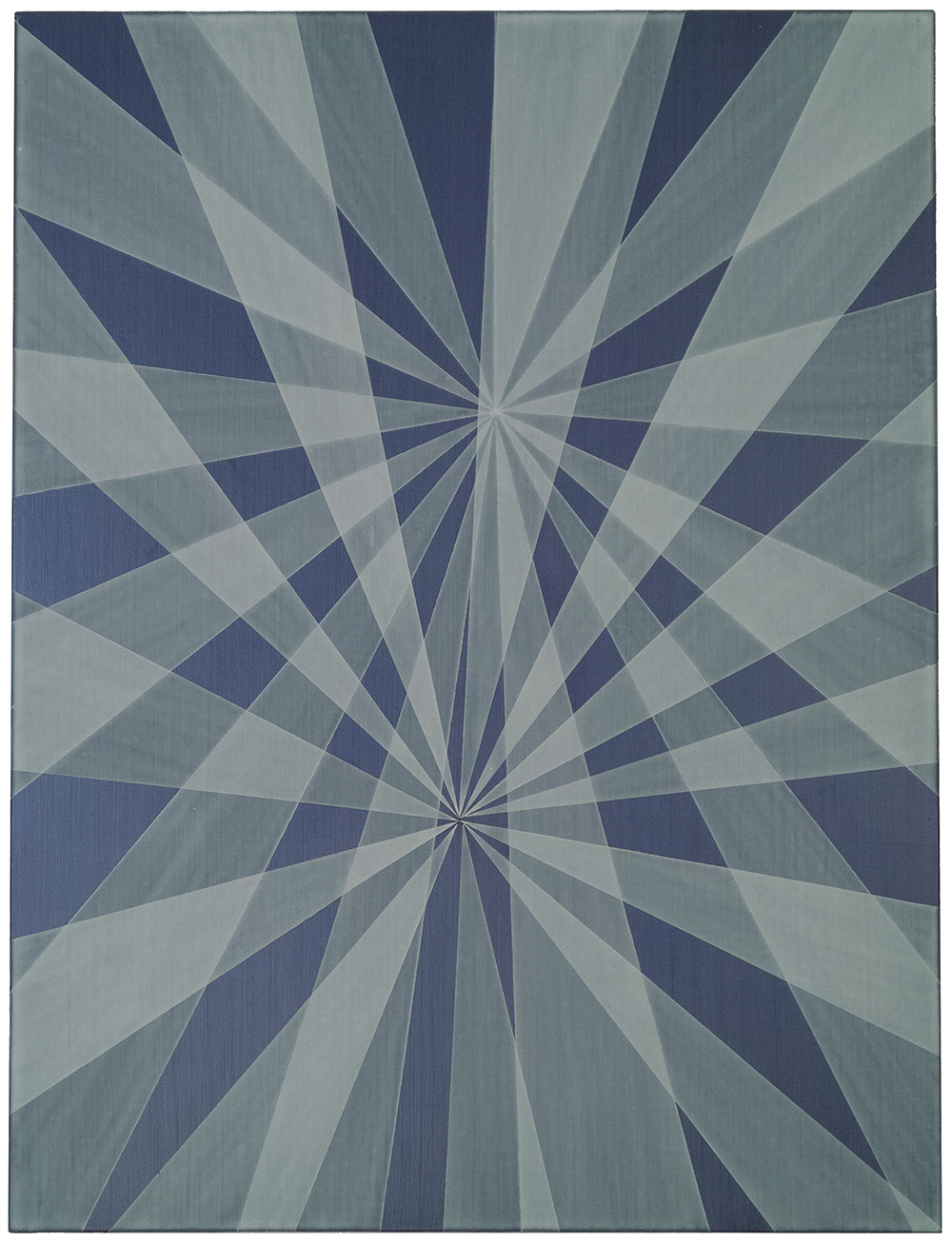
Poles Apart, July 25, 2016, acrylic on linen, 24 x 18 inches
JG: You are a wonderful writer also. Can you talk about how – if – your writing influences your practice, or vice versa?
CF: Well, being a writer you see a lot of art and you talk to a lot of artists so I feel that might help me keep sharp. I get to see a lot of things.
JG: Do you find it’s important to rid yourself of words when you’re in the studio?
Stepping Out of Shadows into Striped Light, July 29, 2016, acrylic and oil on linen, 30 x 24 inches
CF: Swear words are helpful (laughter). Not really, no. I keep a notebook and I’ll write down ideas for titles. Like that one – Stepping Out of The Shadows Into Striped Light – that came from a Captain Beefheart song. I’ll steal from wherever I can get it, so if I hear something on the radio I might write it down.
JG: So the titles aren’t defined by a specific series.
CF: The whole series is called Complicated Shadows and that came from an Elvis Costello song about black and white detective films – film noir. The idea of walking through the trees in those complex shadows dovetailed very nicely. As the paintings move along they develop their own personalities and then titles come out of that. This one again, called An Uncommon Epiphany – it was uncommon to me because I hadn’t done it before. That was sort of when the lights went on.
JG: So when did the lights on for you as an artist. Were you an artist as a child?
CF: Well, I had several inspirations – my father was an artist – a Sunday painter. He was a doctor, but I remember him painting out in the field. He had some chops – he made some very nice paintings. And I took lessons from a neighbor down the street, and then there was a teacher in high school who was a watercolor painter. I turned out to be a very mediocre watercolor painter, but he focused my mind on the importance of art. And then what cemented it were some of the people I met at Davis.
JG: Did you enter Davis as an art major?
CF: Well, I was aspiring. It was a good education.
JG: Please tell us it’s true that you were in the circus.
CF: It was. I had more hair then, and I wore tights. It billed itself as the smallest circus in the world and it was called the Royal Lichtenstein Quarter-Ring Circus. The whole idea of a circus was that you had to have a ring of a certain size so that you can have a horse go at a certain gait so that people can do tricks on them. Nick Weber, who was the founder and producer of the circus realized that if you had a smaller horse you could have a smaller ring. And then people can be up close – right next to the action. This was back in the late 1960s. He got miniature stallions, about this high, and he had dogs and cats doing tricks in the back, behind that. We had a black bear as big as me – he weighed 350 lbs, performing unmuzzled – I don’t know how we got away with that. We had a wooly monkey, parrots, goats — a menagerie.
JG: And what did you do?
CF: I did juggling and vaudeville acts – gags, really – that make you understand why Vaudeville died. (laughter) I did some stage managing – I did Metamorphosis which was an escape that Houdini popularized. We did 41 states in 9 months – 200 shows. We had a trapeze. The whole show took about 3 hours to set up and about 2 hours to break down. My boss liked to drive to a new venue every night because he didn’t want everyone to see all the magic and figure it out. So, imagine how you would feel at the end of that tour. At some point I realized that I was never going to be a great clown. You know? But I really appreciated the experience.
JG: So what do you do today that we don’t know about? (laughter)
CF: Well, I keep bees. And, you were speaking about color – bees have a totally different range of color sensitivities. Red doesn’t register with them. I like bees because they’re an alternative reality. They are their own universe — they have a social society just like we do but they behave in such a complex and different way.
JG: Let’s open up our talk to some questions from the audience.
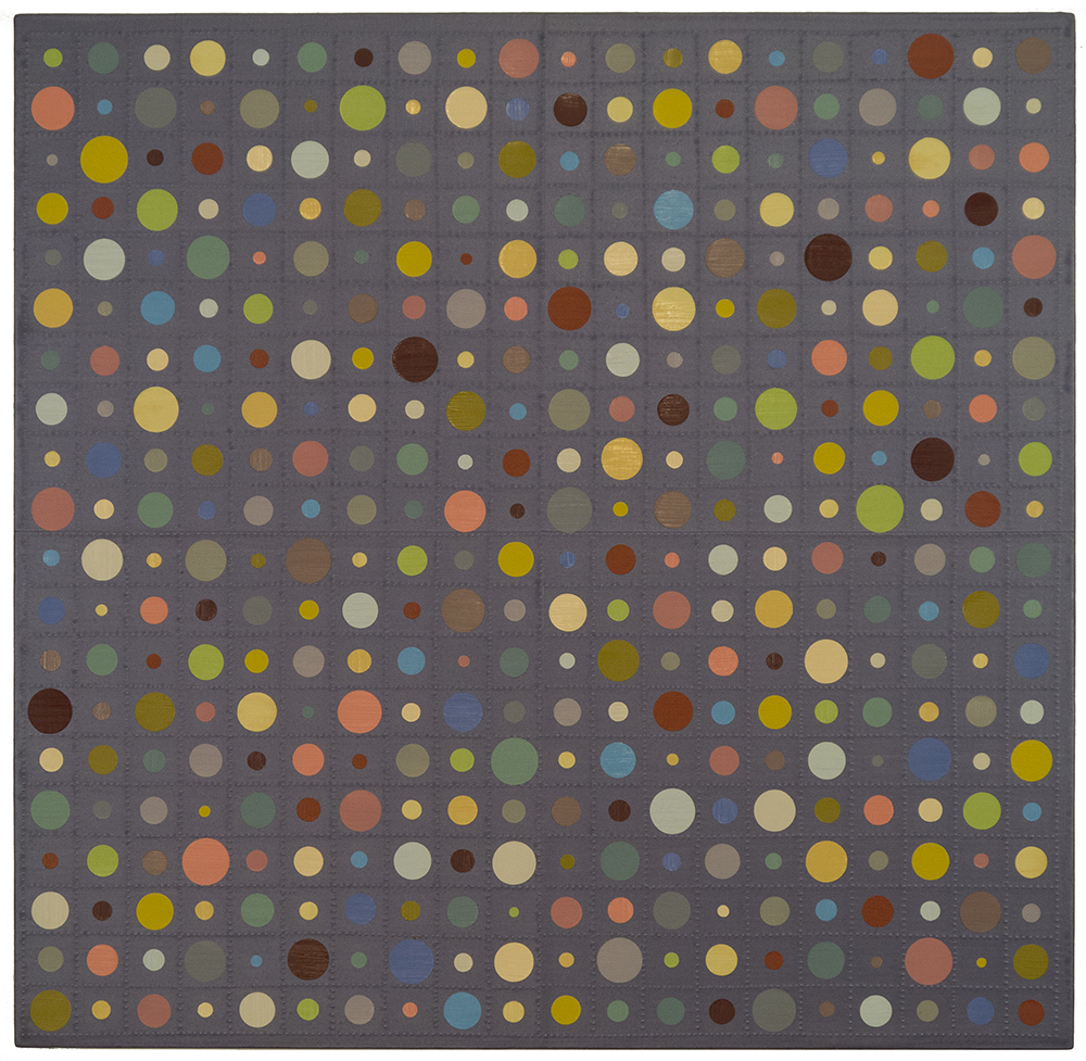
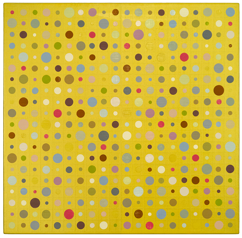
Terrie Sultan: I know this isn’t really quite fair, but I actually do have a question. As I’m sitting here looking at the earlier painting of the dots it makes me think of the 28 years we’ve been together and of all the paintings I’ve seen you make, this body of work is the first time its actually made me think about space and the structure of space. The other work has been specifically planar.
I Dreamt of Locks and Keys, May 24, 2016 oil and acrylic on paper, 24 x 18 inches
CF: It’s true they’ve been very planar – shallow space – and much influenced my minimalism, by the way. When I started doing these works I began with very simple gouaches and acrylic studies on watercolor paper. They were a lot looser and part of what I wanted to do was to take that minimalism precision and translate it in a different way. The geometry became very important. It’s the ground that you’re seeing that helps deliver the depth. But it’s also all the layering on top of it.
Audience: I’m reminded of Robert Irwin’s statement, “seeing is forgetting the name of what you see.” When I look at these paintings and try to turn off the whole thought process thing and just work at perception and seeing, there’s so much going on there.
CF: I like the idea of that – that it takes you out of yourself. You get almost a Gestalt response – as if you read it as an entity.
JG: Your technique has always fascinated me – as if there’s sleight of hand involved. The execution is so mysterious now, and in your earlier paintings. Is that the magician in you?
CF: I think it’s more like translation from one visual idiom to another. My concern is trying to find the pattern or the structure. Many of those earlier paintings were based on flowers. It’s interesting – we know that every flower has a very beautiful exterior but they also have, for the most part, a very rigorous internal structure. Our tendency is to take that structure for granted. There’s a multitude of individuals – bees, for example – that communicate via one central being through pheromones. It’s effective, highly developed, non-verbal communication. I look at nature in that way – that there’s a unifying substructure. For me, it’s like the connective tissue between one body of work and another. I’m not a landscape painter, but I’m influenced by the landscape through a means of communication that is completely non-verbal.
Remains of the Day, July 7, 2010
Braille, paper with oil and acrylic on linen, 21 x 20 1/2 inches
JG: Thank you for spending some time with us Chris.
CF: Thanks, it’s been fun.
Janet,
Once again: you are the very best interviewer!
Brilliant interview and beautiful work. Fascinating, both visually and verbally.
Thanks again,
Best,
Elaine
Fantastic interview! I was surprised to learn more about my dear brother, and how he’s translating his perceptions into art. Love the latest pieces.