David Brody
David Brody is a painter, occasional filmmaker, and sporadic writer. Aside from his recent film installation at the Boiler, he has had solo painting shows at Pierogi and Sometimes Works of Art (James Siena’s project gallery in Chinatown). In November he will show paintings at Studio 10 with Elliott Green. Brody’s animations have been included in programs at The National Gallery of Art in Washington, MoMA, The Reina Sofia Museum, and the Centre Pomidou, and he has made wall drawing installations for the Brooklyn Museum and the Drawing Center. Brody’s critical writing appears in Artcritical.com, and he has written for Cabinet, Bomb Magazine, and The Brooklyn Rail.
Question:
Color is used in to different ends in your paintings and animations. In the animations, color marks an outline, largely to define one shape against another. In the paintings, your use of color is more expressive. It drips, mixes and bleeds. Is this strictly because of the limitations of each medium, or do you think about color differently when paintings and animating?
Answer:
I’ve gotten better at color in my recent paintings, I think, and it may have something to do with working on digital animation. My film 8 Ecstasies (installed at Pierogi/The Boiler in 2014) was an abstract line drawing that was rigged to deform in suggestive ways. In responding to my collaborator Zig Gron’s musical score (who was himself responding to the animation) I began to experiment with changing the color combinations of the lines and planes over time. The final year of working on the film (a long-term, start-and-stop project) was devoted almost exclusively to expanding the role of color.
In the pixel world, color is nakedly informational: with 24-bit RGB color, any discernible shade and hue in color space can be located by punching in three numbers between 0 and 255. The 256 possible values of the color components Red, Green and Blue in combination translates to a choice of over 16 million distinct color addresses in a cubic file cabinet –– 256 cubed. (A sequence of 8 binary, yes-no questions can be answered in 28, or 256, possible ways; 8 questions to determine each of the 3 color components = 24 “bits” of information.)
In more or less photo-realistic animation, these color values are spit out by algorithms –– functions of virtual transparency, shine, fog, texture and a thousand other simulative traits, all bouncing and ramifying together with local color as affected by virtual light-incidence at the frame being rendered, the constructed instant. But when all that impressive calculating is done, it’s simply a matter of those three numbers between 0 and 255 per pixel –– 24-bit RGB.
My knowledge of math is high-school-level –– too limited to work creatively with one’s own algorithms. In any case, 8 Ecstasies was intended to be purely graphic –– flat, solid colors chosen by eye. There were no illusionistic filters applied by 3-D simulation, and as little numerical prejudice about the color values as possible. I directly controlled any impression of light and atmosphere, as in painting or drawing.
I was mostly working on a kind of timeline, a graphic interface known as a curve editor. For readers who haven’t done this sort of thing, imagine that we set Red to a value of 255 at frame 1; if, scrolling ahead to frame 90, we set Red to 0 there, the curve editor will interpolate the values of the in-between frames. (A fully tensioned interpolation curve –– i.e., a straight line –– would set the value at frame 45, the midpoint, to 128; whatever its G and B values, the animated color would be getting less reddish over three seconds of animation.) Aiming empirically for vividness at keyframes, tweaking curves, then rendering out full tests, I gradually assembled the film.
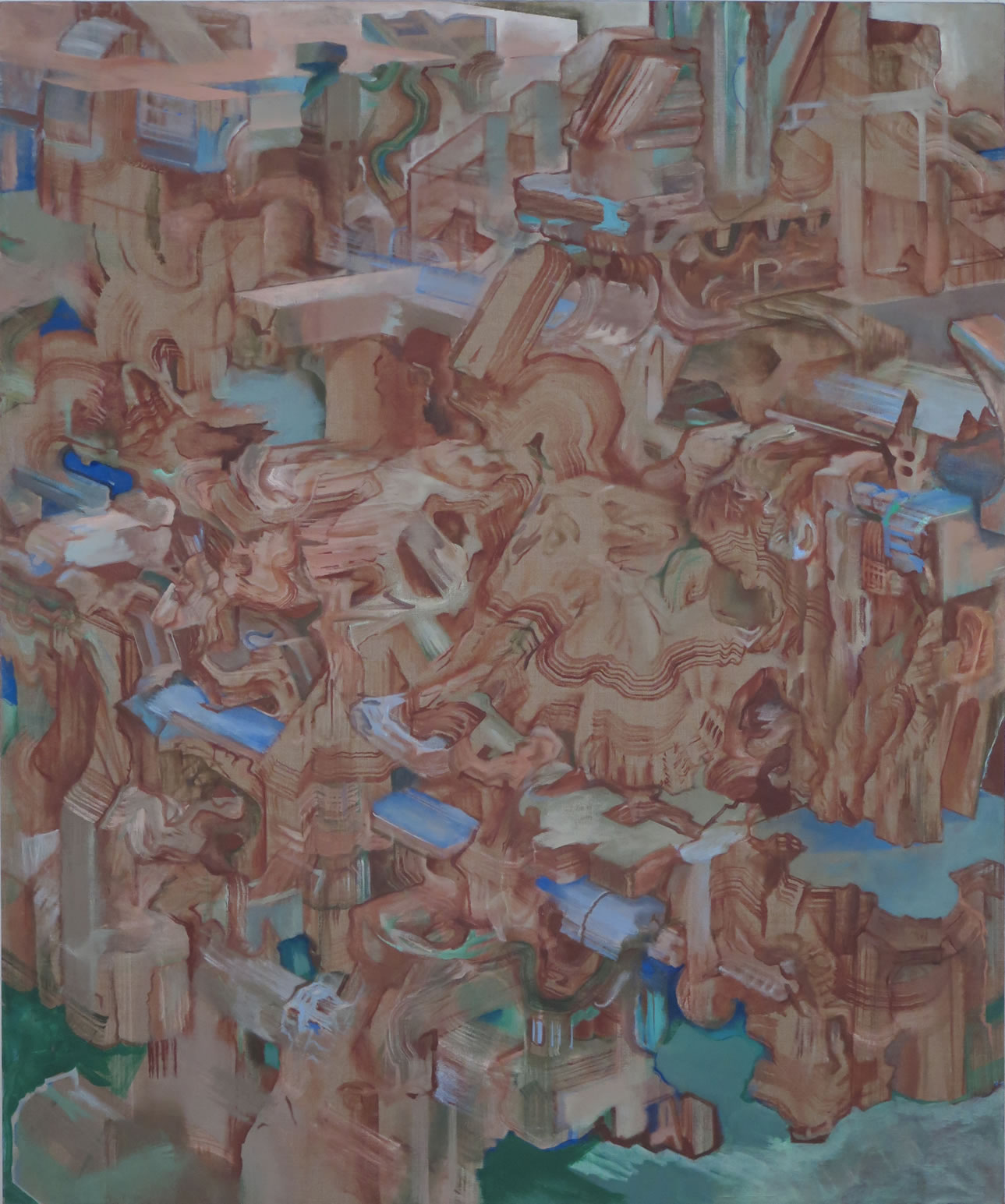
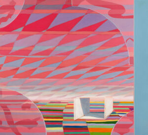
“Rubble of Its Own Debris” oil on linen, 2009, 60”x50”
I’ve painted for years at a time in black and white; equally, black on white. I’ll add maybe an indian red, then some yellows and blues. Gradually, tube by tube, things will get out of hand . . . and a couple of years down the road there will be a rupture, after which I’ll go back to monochrome. (But even then, with shades of gray, color gets the last word.)
When I began painting again after the film I spread out a much-enlarged array of pigments. My color choices have always been, in a sense, informational: like the four color-coded wires in an old landline phone, each new thread of color need only keep visually untangled. But after running the numbers on so many color permutations, then visually sorting through them, perhaps I was better attuned to how things can flip suddenly, how colors can leapfrog.
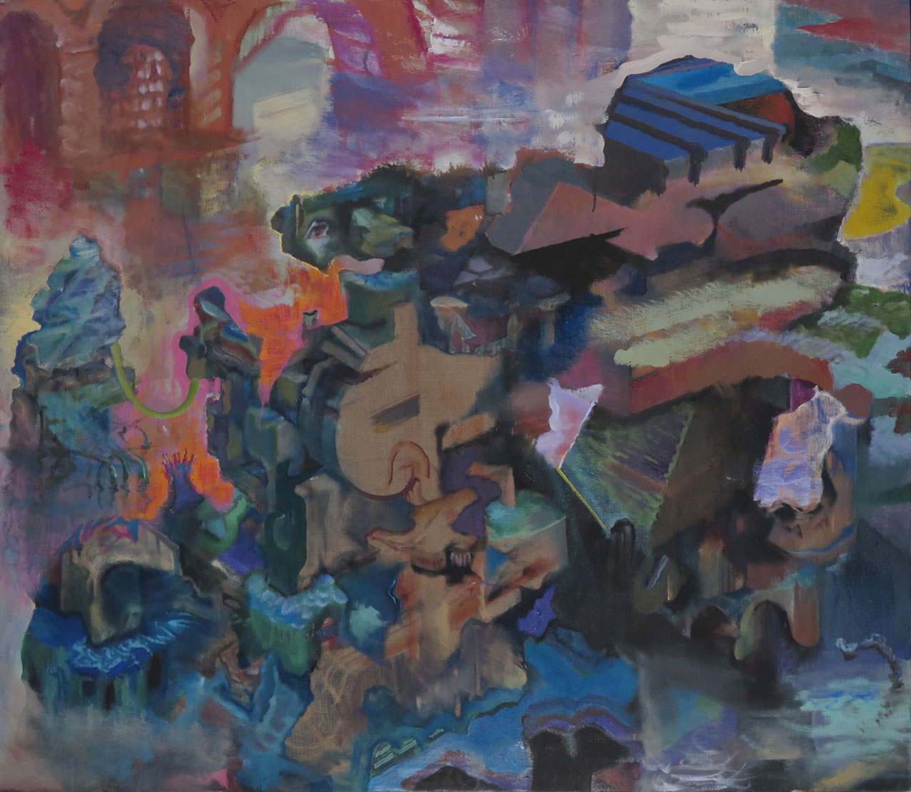
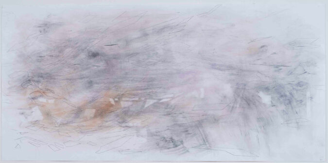
“Arrivals/Departures” Oil on linen, 2016, 36”x42”
I’ve also begun to see how blends are animations. (Elliot Green drew my attention to this deep analogy.) Against my wishes (but by design) those threads of color have taken to fighting, getting dirty, getting bloody: blending. In the chaos, some colors shout for reinforcements. Others make alliances, or perish by the wayside. Meanwhile, flickering illusions emerge, of light and shadow, surface and reflection, atmosphere and distance –– the exact opposite of algorithms, it seems to me.
These nodes begin to exert visual magnetism. Forces gather. And as the painting comes together into one single thing these forces must join or die. What I meant by color always having the last word is this: when you finally see the color, that’s when you know the painting is a single thing. Then you can walk away.