


Grave Videos
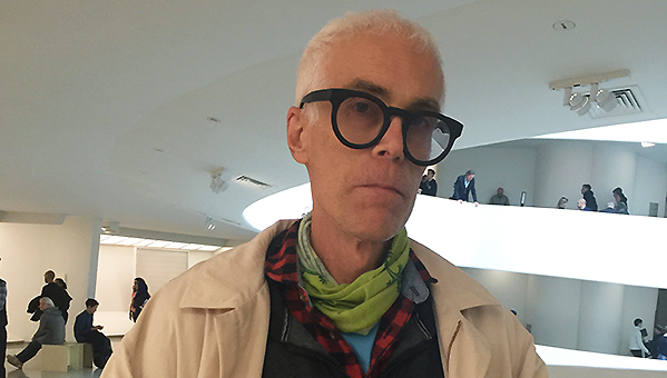
Matt Freedman – Interviews 2015
Matt Freedman, one of the founders of Romanov Grave, died on October 24, 2020. Matt Freedman was a prodigious sculptor, performer, writer and curator. We cherish his memory and his art and writing.
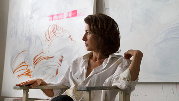
Jackie Ferrara
Full interview interview with Jackie Ferrara in her studio in July of 2012 with Andrea Blum.
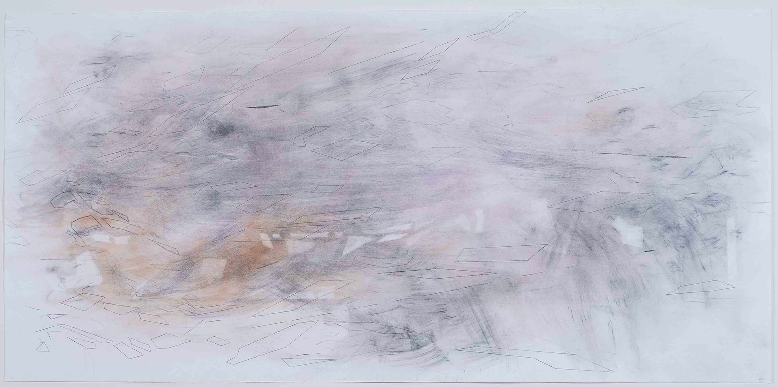
Jackie Ferrara (born 17 November 1929, Detroit) is an American sculptor best known for her pyramidal stacked structures. Her work is in the collection of the MOMA, the LACMA, the Louisiana Museum of Modern Art, and the Phillips Collection, among others. Go to http://www.jackieferrara.com/
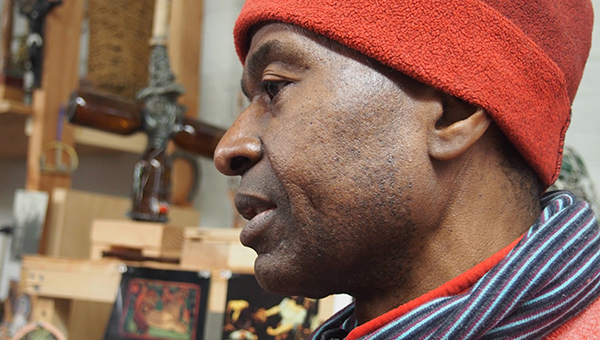
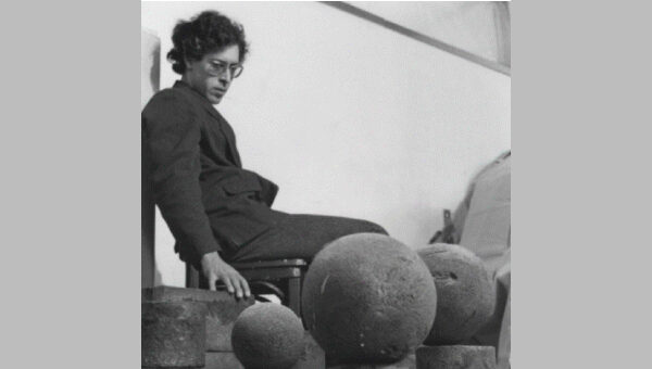
Thomas Kovachevich
Born in Detroit, the New York-based Tom Kovachevich is both an artist and a physician. He first exhibited his work at the Penthouse Gallery at MOMA and was included in Documenta V, 1972. In 2011 he exhibited at Callicoon Fine Art in NYC. In each video segment of the Thomas Kovachevich interview, a question is asked and answered.
This interview is produced by Romanov Grave and Davidson Drasler Productions.
Reviews
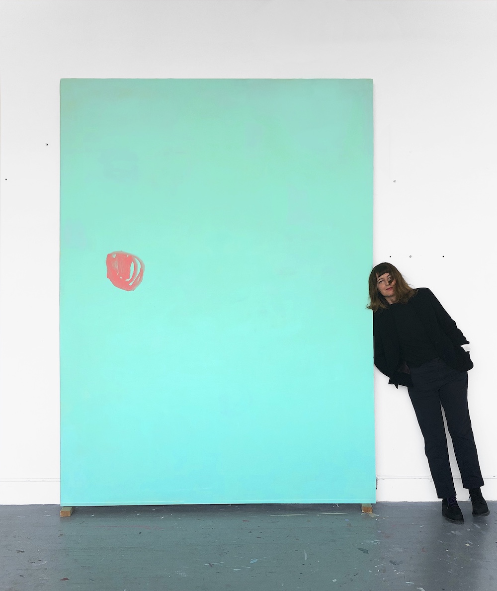
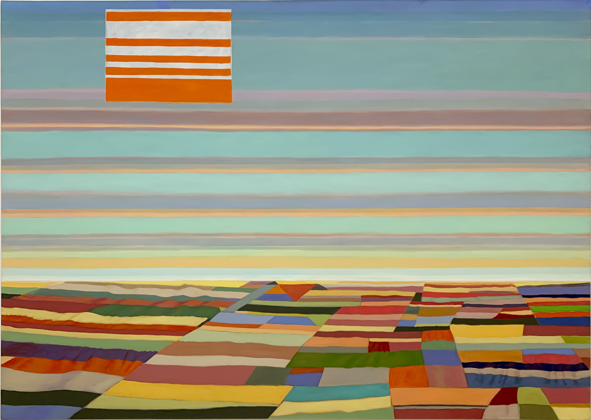
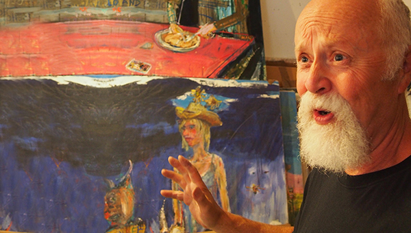
GREG DRASLER
There is a moment, if memory serves, about halfway through Godard’s Pierrot Le Fou, where his camera is following Belmondo and Karina as they scarper across the cliffs overlooking some gorgeous Mediterranean inlet. They are on the lam; someone is dead, killed. I do not recall if they are being chased, probably. Tension mounts, (that […]
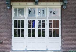
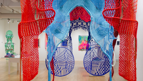
Collaborate, Contaminate, Care
Tucked away in a quiet area in the center of Amsterdam are the 120-odd studios of Atelier WG, named after the former hospital Wilhelmina Gasthuis, on which premises the studios are located. The studios are spread over two buildings: still known as ‘maternity ward’ and ‘eye clinic’ respectively. Some of the artists working in either […]
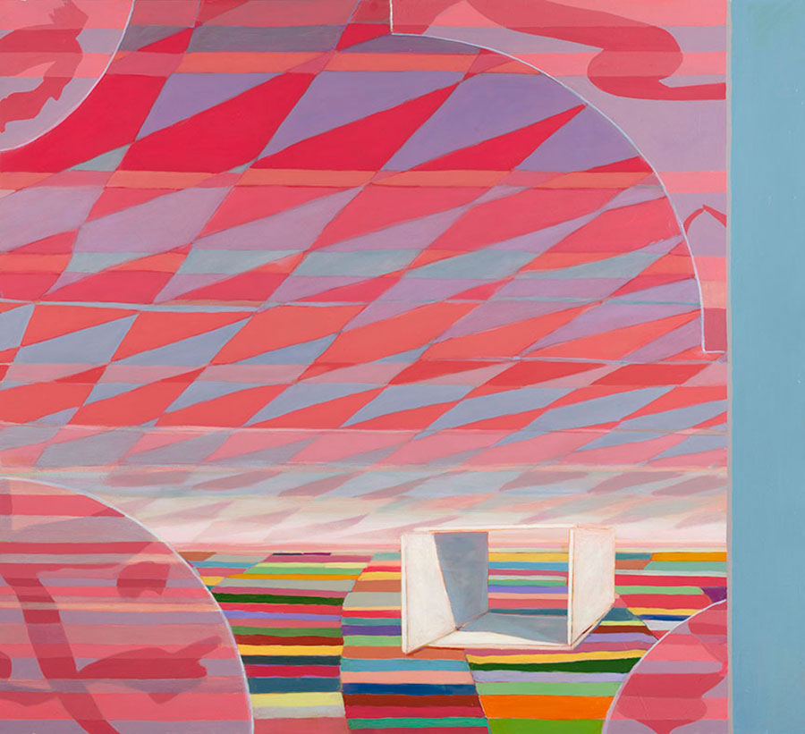
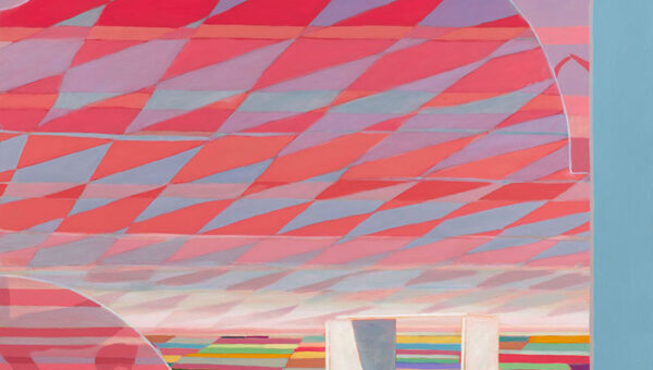
What a World
The individual works of art in “What a World, What a World” hold together in such a seamless narrative that walking into the exhibition felt like dropping into a world ready-made.
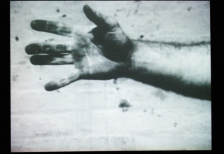
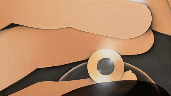
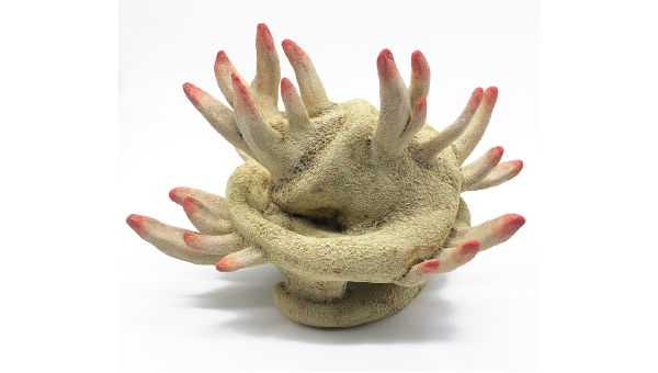
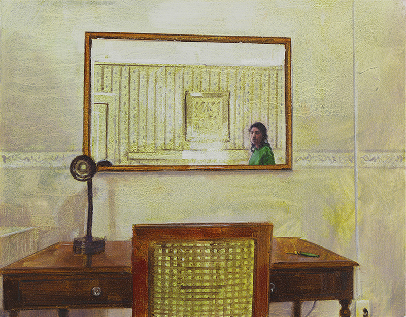
TALK TO THE HAND
Hands are well known for picking noses and pockets, giving fingers, reaching across oceans and the like. In the 1960s some were making peace signs. In 1968 one of Richard Serra’s was catching lead. It takes a little help from the title to grasp (sorry) what is actually happening. Off screen someone is dropping or […]